Bean & Bloom
What I Made
- Logo & Wordmark
- Hand-Drawn Ampersand Mark
- Pattern & Packaging
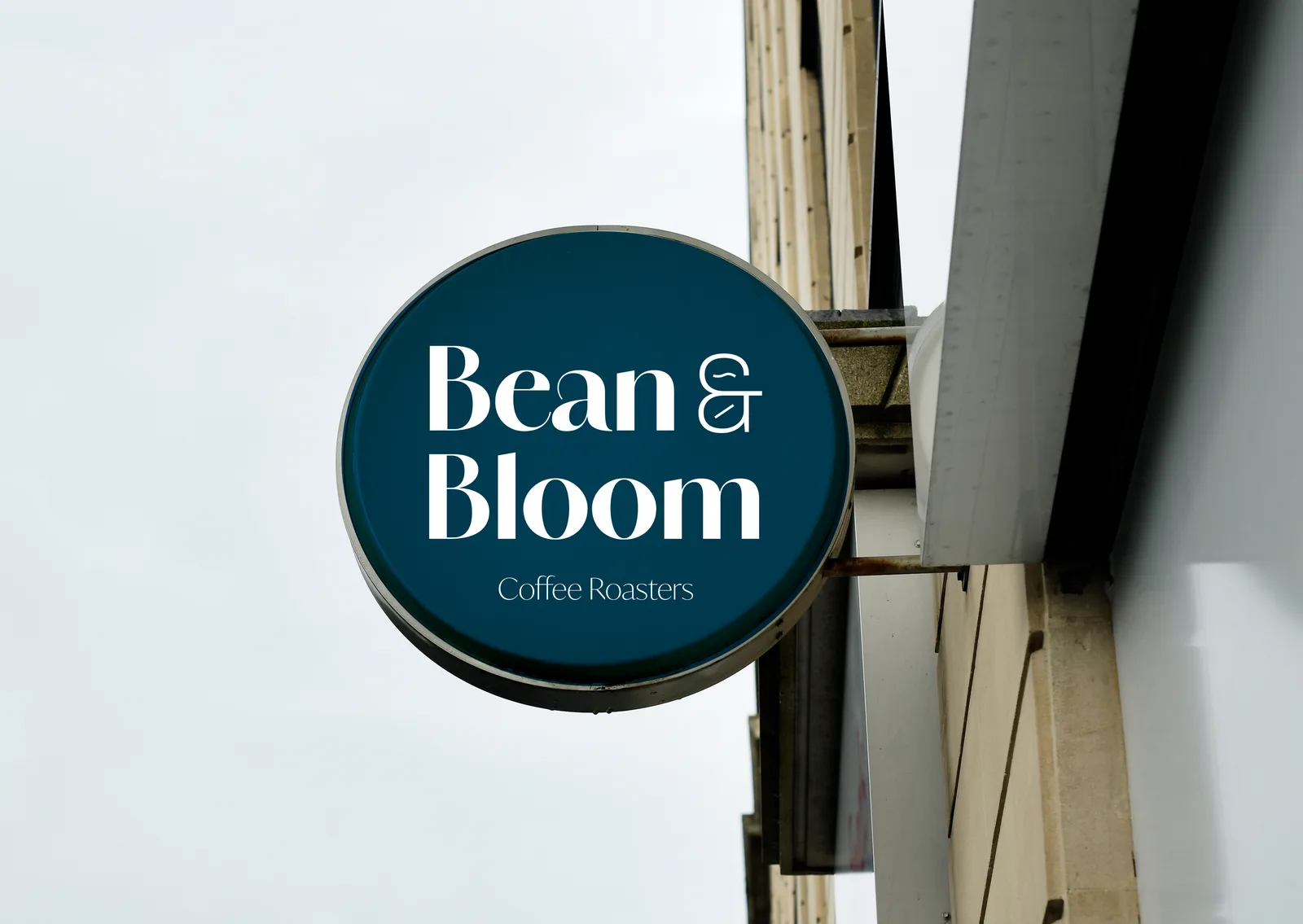
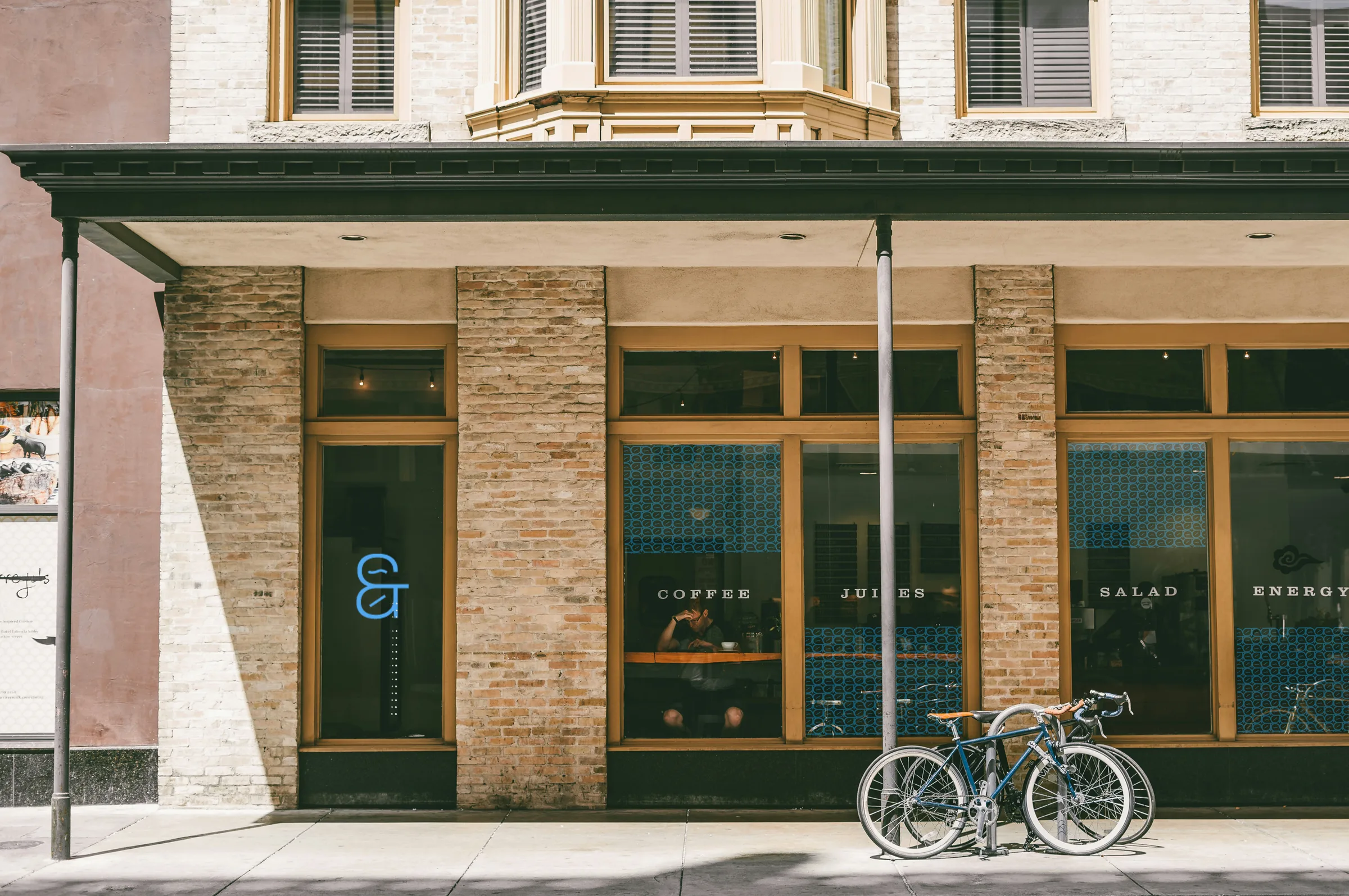
- Signage & Storefront
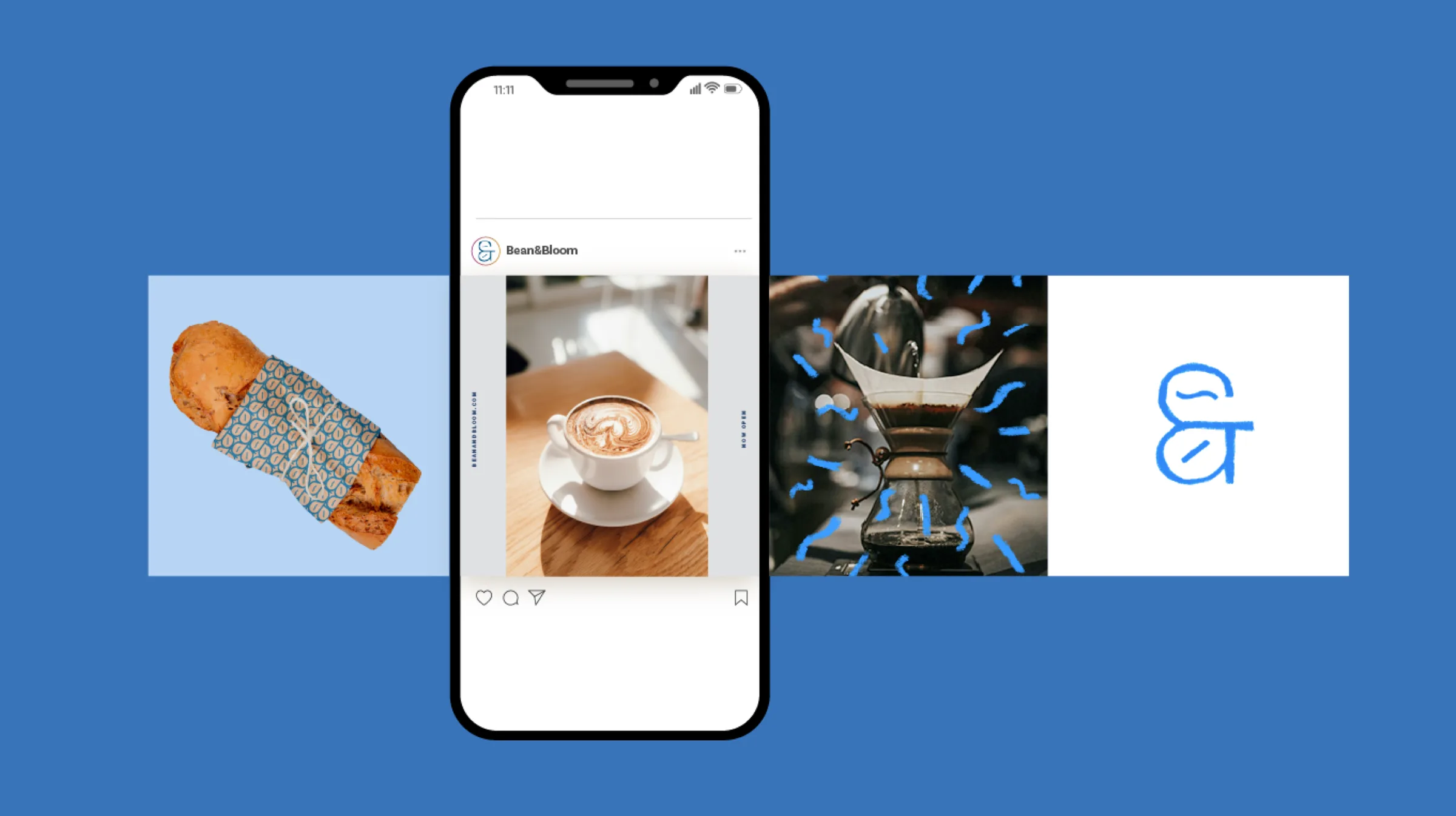
- Social Media
- Type & Colour System
The Name
“Bean” is the dedication to quality coffee. “Bloom” is the community that grows around it.
The name reflects a passion for both coffee and the vibrant atmosphere of the café. “Bean” stands for the care that goes into every cup, from the careful selection of beans to the brewing. “Bloom” represents the community it fosters: a place where people come together to connect, create and feel inspired.

The Mark
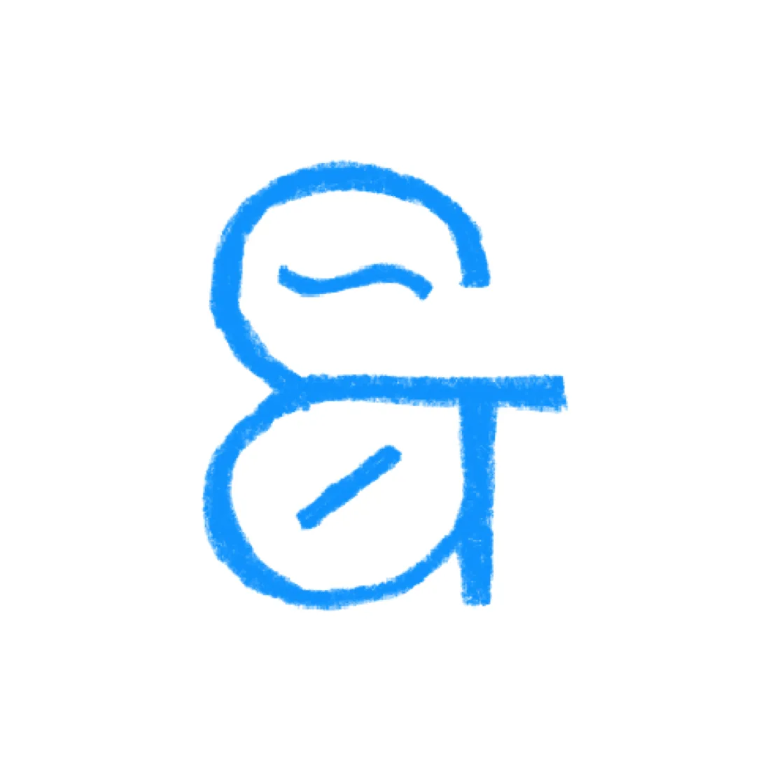
The ampersand brings the two ideas together in one distinctive mark, creating a visual connection between coffee and nature. Its flowing shape gives the logo a sense of movement and balance, reflecting the brand’s blend of craft, freshness, and natural character.
Pattern
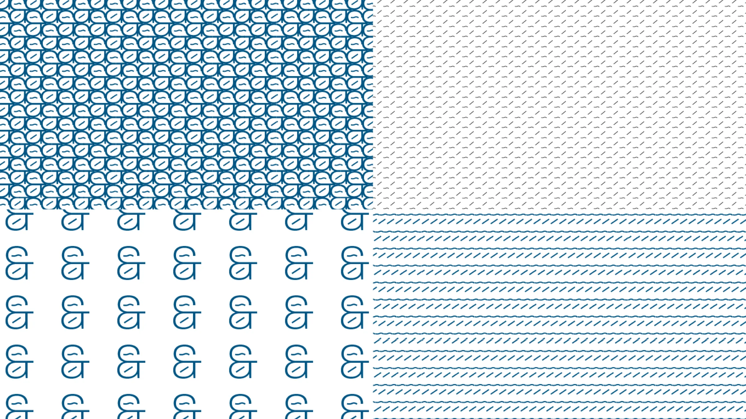
The mark breaks down into a family of patterns: the full ampersand, its bean and leaf shapes locked together, and the wave and line strokes on their own.
Packaging
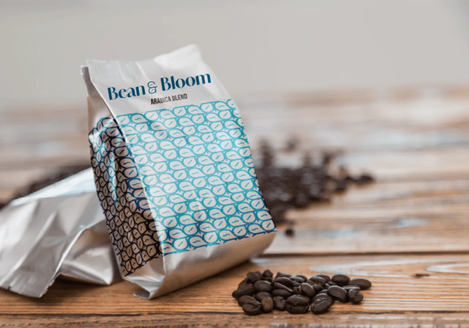
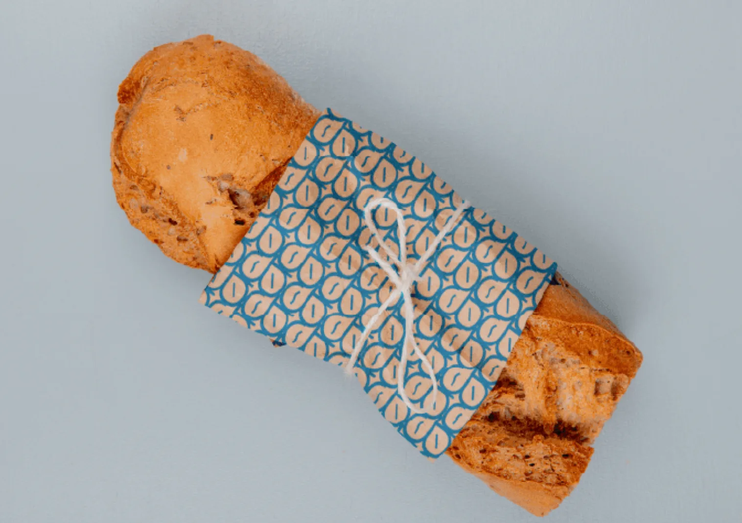
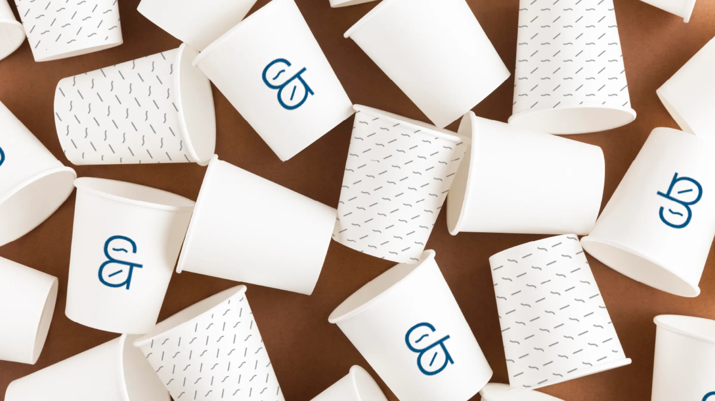
The patterns wrap everything the café sends out, from bags of Arabica blend and takeaway cups to fresh pastries. Silver, white, blue and kraft paper keep it simple, so the pattern does the talking.
Social
Type & Colour
Amandine Bold
IvyMode